Who has the best helmet in the Mountain West Conference?
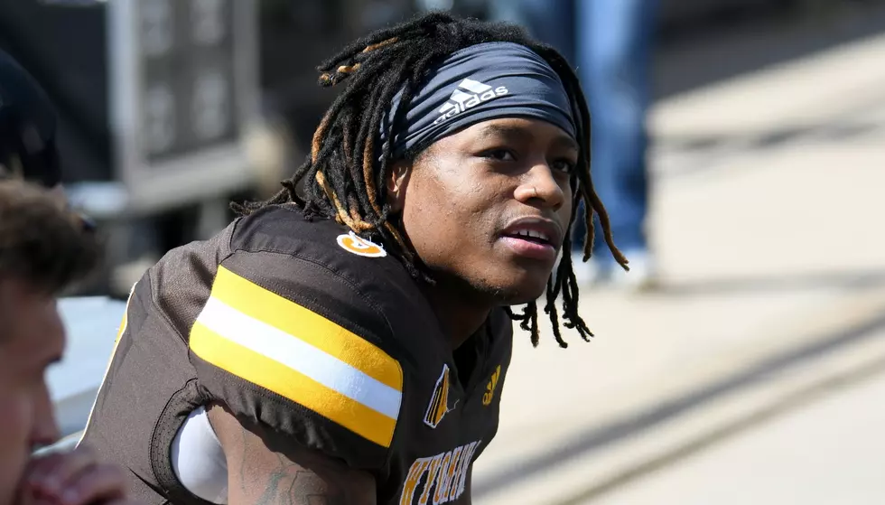
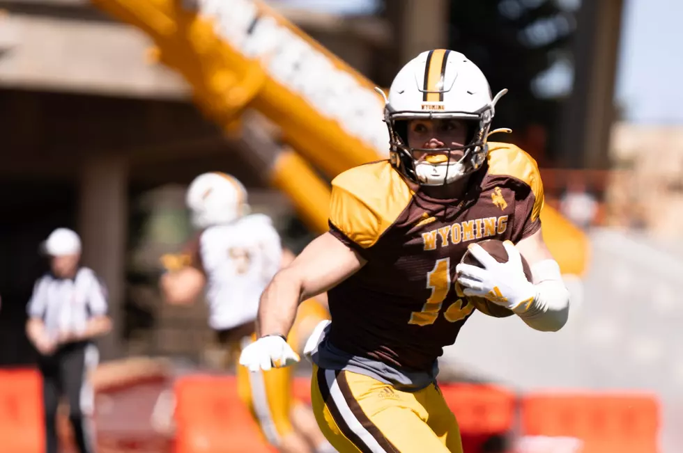
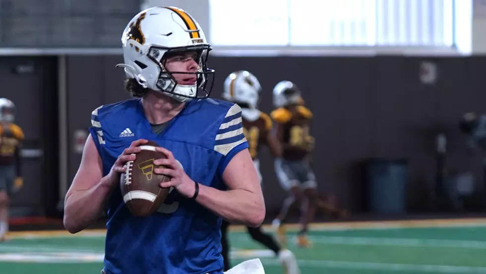
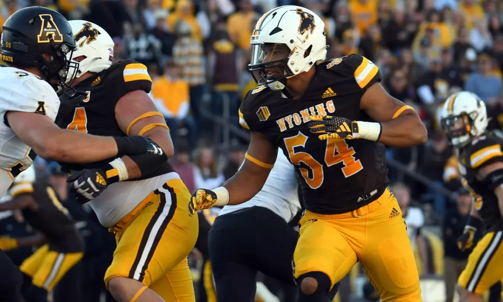
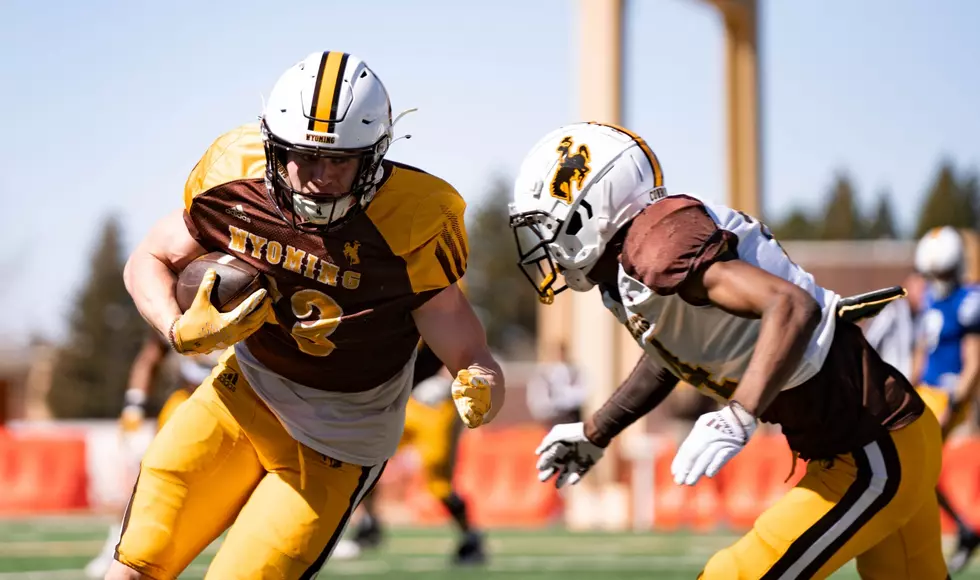
LARAMIE -- Let's be real, Wyoming has an iconic helmet. Steamboat, the colors, the whole nine.
You know you have a great logo when you can look at it and immediately know who it belongs to. That's the Cowboys.

247sports.com released its Top-25 football helmets in college football. You can find that full list right HERE.
Spoiler alert: Wyoming is ranked 24th in the nation out of 131 schools. Not bad. The Pokes are the lone Mountain West program to crack this list. Shocked? Me neither.
MORE UW FOOTBALL COVERAGE:
* You won't be hearing any title talk from these Cowboys
* Pokes peeved about predictions? Not quite
* Will any true freshmen see the field this fall?
* Craig Bohl: 'We have the ability to be pretty good'
That's not to say the league doesn't have some solid selections.
Here is my attempt at ranking MW helmets from 12 to 1:
12. NEVADA
OK, so this isn't Nevada's worst look. Up close, the helmet with the "Pack" script is actually pretty cool. What isn't is the "warthog" logo that typically adorns at least one side of the Wolfpack's headgear. If there's a redesign ahead for any team in this league, it's the guys in Reno.
11. NEW MEXICO
The Lobos have had some cool helmets in their history. Definitely dig the matte lids, but this current logo is not the best effort. The interlocked "UNM" is sharp. The old school Louie Lobo with the wolf licking his lips is the best -- hands down. Also love that New Mexico incorporates the state flag. That's a good look.
10. UTAH STATE
The helmets featuring a bull are legit. Love that look for the Aggies. The big "U" with "State" through it is fine, but could be much cooler.
9. SAN JOSE STATE
The white version of the Spartans helmet is actually pretty sweet. The spear that makes up the helmet stripe is a nice touch, too. The Mountain West has some solid options, so the fact this one is so low shows you how good the options really are.
8. COLORADO STATE
Ram horn. How original, right? CSU's look is fine. I actually really dig the "Ram Bone" helmet. The Rams have a really cool old-school logo. You know the one ... looks like a North Carolina knock off. I think that would be a really nice alternate helmet in the school's green-and-gold colors.
7. FRESNO STATE
The "Bulldog" script has grown on me. In the Trent Dilfer days, I thought this was a really bad idea, considering you could have a mean looking dog on your lid. Fresno State has some cool options. Always love the green "V" on the back, an homage to California's Central Valley.
6. BOISE STATE
You're probably asking yourself, which helmet are we even talking about? Seems like the Broncos bust out a new shell on a weekly basis. I actually really like the large Bronco head on one side and the number on the other. Those look pretty sharp. I think it looks particularly solid in white.
5. AIR FORCE
This is one of the more classic looks in college football. The Falcons don't deviate much from the original lightning bolt, which is just fine. It's iconic. I really like the blue helmets with the white bolt. The Academy's yearly alternate helmet is great, too.
4. UNLV
The Rebels have a great look all around, in my opinion. I don't mind the classic "UNLV" on the sides, but I really liked the "Hey Reb" logo. I'm sure that's a thing of the past because of the whole Confederate thing, but they were great. Really like the matte look.
3. HAWAII
The 'Bows have had a few different options for headwear, but I really like the Hawaiian islands logo. No other state features such a unique shape. They are the state's only FBS school. That, along with the tribal designs on the stripe are a fitting honor for that school. The green and black is sweet, too.
2. SAN DIEGO STATE
The Aztecs had a logo crisis on their hands throughout much of the 80's and 90's. Remember when the school did that odd fade from black to red? With such an awesome logo, you'd think SDSU would have some seriously iconic helmets. Well, now, they kind of do. It's a really busy design, but it works. The "Aztec sun" is sweet. Stick with it.
1. WYOMING
I happen to agree with 247sports on this one. Yes, I am a Wyoming native. Bias? Maybe. The Cowboys' logo is, well, perfect. There's really no other way to put it. Maybe brown and gold isn't for everyone, but there's no denying the power and pride behind that bucking horse. It's a beauty. And it's here to stay.
University of Wyoming’s Top 50 Football Players
- University of Wyoming’s Top 50 Football Players
More From 7220 Sports

